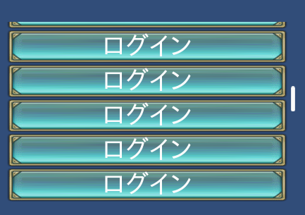
SCROLLBAR
This is a control to display the scroll bar.
By assigning to the scrollable control, this control is enabled.
By associating SCROLLBAR control the GROUP property, it is possible to display a scroll bar.
It is also possible to assign some scrollbars to a scrollable control.
It is listed scrollable controls below.
You can not set HIT or NOHIT flag to STYLE property.
SCROLLBAR(Control name) {
Property 1;
Property 2;
:
:
Property n
};
Example
$w = 300;
LISTBOX(List) {
  ID = 001_100_00000;
  POSITION = 0,-160;
  STYLE = ANCHOR_BOTTOM;
  SIZE = $w,160 - 16;
  CONTENTS_SIZE = $w,48;
  CONTENTS = {
    CHECKBOX(IP) {
      ID = 001_000_00020;
      CAPTION = 001_000_00030;
      STYLE = ANCHOR_LEFTTOP;
      POSITION = 0,0;
      SIZE = $w,48;
    };
  }
  GROUP = SCROLLBAR(List);
};
SCROLLBAR(List) {
  ID = 001_100_00010;
  DEF_SCROLLBAR;
  STYLE = ANCHOR_RIGHTTOP;
  POSITION = 0,16;
  SIZE = 0,-16 * 2;
};
Position and size
Unlike normal control, handling of location and size of this control is special.
The position and size are relative to the scrollable controls that are assigned.
Position and size is a relative value from the scrollable are related control.
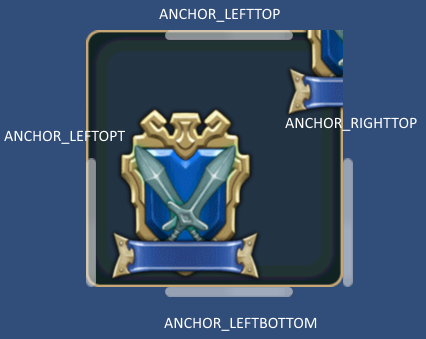
Valid anchors to see here .
#include "wr.h"

WINDOW(255_000_00001) {
      STYLE = NOTITLEBAR|ANCHOR_CENTER;
      POSITION = 0,0;
      SIZE = 256,256;
      TEX_ID = 100_000_00001;
};

CONTAINER(Map) {
      ID = 000_000_000100;
      POSITION = 0,0;
      SIZE = RELATIVE_SIZE(0),RELATIVE_SIZE(0);
      CONTENTS_SIZE = 512,512;
      COLOR = COLOR32(255,255,255,255);
      CONTENTS = {
              BUTTON(A) {
                      STYLE = BASE_LEFT;
                      PRIORITY = -1;
                      POSITION = 0,256;
                      TEX_ID = "TQML0";
              };
              BUTTON(B) {
                      STYLE = BASE_TOP;
                      PRIORITY = -1;
                      POSITION = 256,0;
                      TEX_ID = "TQML0";
              };
              BUTTON(C) {
                      STYLE = BASE_BOTTOM;
                      PRIORITY = -1;
                      POSITION = 256,512;
                      TEX_ID = "TQML0";
              };
              BUTTON(D) {
                      STYLE = BASE_RIGHT;
                      PRIORITY = -1;
                      POSITION = 512,256;
                      TEX_ID = "TQML0";
              };
      };
      GROUP = SCROLLBAR(LEFT),SCROLLBAR(RIGHT),SCROLLBAR(TOP),SCROLLBAR(BOTTOM);
};
SCROLLBAR(LEFT) {
      STYLE = ANCHOR_LEFTTOP;
      TEX_ID = "SCBBH";
      POSITION = 0,0;
      SIZE = 0,0;
};
SCROLLBAR(RIGHT) {
      STYLE = ANCHOR_RIGHTTOP;
      TEX_ID = "SCBBH";
      POSITION = 0,0;
      SIZE = 0,0;
};
SCROLLBAR(TOP) {
      STYLE = ANCHOR_LEFTTOP|ITEM_STACK_H;
      TEX_ID = "SCBBV";
      POSITION = 0,0;
      SIZE = 0,0;
};
SCROLLBAR(BOTTOM) {
      STYLE = ANCHOR_LEFTBOTTOM|ITEM_STACK_H;
      TEX_ID = "SCBBV";
      POSITION = 0,0;
      SIZE = 0,0;
};
Direction of the scroll bar
You can use not only the vertical scroll bar but also the horizontal scroll bar.
Please set the following values to the style.
Vertical: ITEM_STACK_V
Horizontal: ITEM_STACK_H
Display control of the scroll bar.
By setting the style, you can choose the scrollbar display type whether display or hide.
You can choose from the following three types.
SCROLLBAR_DISPLAY_NORMAL(Default)
Only when the area is scrollable and you touch the scrollable area,it is displayed.
SCROLLBAR_DISPLAY_SCROLLABLE
It display only when the area is scrollable.
SCROLLBAR_DISPLAY_ALWAYS
Always displays.
Property
Default value
TEX_ID = "SCBRH";
STYLE = ITEM_STACK_V;
COLOR = 1,1,1,1;
ID = Control ID
Define the control ID.
ID = 001_000_00010;Note
If you don’t set the ID, it generates automatically from the hash value.
POSITION = X, Y
It determine the display position. It becomes relative position from a scrollable control.
POSITION = 0,16;You cannot specify a percentage.
TEX_ID = Texture ID,Part ID
TEX_ID = Part ID
You set the texture ID and the part ID.
SIZE = width,height
Set the display size of the scroll bar. It is the relative size of the scrollable control.
SIZE = 0,0; //display sizeYou cannot specify a percentage.
COLOR = R,G,B,A
It is possible to set the color values . By changing color , it affects all of the controls that are included .
Set R, G, B in the range of 0…2 .
If you set a value in excess of one , each color component can double the brightness.
Set A in the range of 0…1 .
STYLE = Flag0|Flag1|..|Flagn
You can set the display anchor of control.
Display position anchor flag |
Description |
|---|---|
ANCHOR_DEFAULT |
Set the anchor position in the upper left Same as ANCHOR_LEFTTOP The default control center position is set to BASE_LEFT. |
ANCHOR_LEFTTOP |
Set the anchor position in the upper left The default control center position is set to BASE_LEFT. |
ANCHOR_LEFTBOTTOM |
Set the anchor position to the left. Located along the lower edge The default control center position is set to BASE_LEFTBOTTOM. |
ANCHOR_RIGHTTOP |
Set the anchor position in the upper right The default control center position is set to BASE_RIGHTBOTTOM. |
ANCHOR_RIGHTBOTTOM |
Set the anchor position to the right Located along the lower edge The default control center position is set to BASE_RIGHTBOTTOM. |
The actual placement, please refer to the figure below.

Style that limits the function as follows .
Function limit style |
Description |
|---|---|
HIDE |
Hide. |
ITEM_STACK_V |
Set to the direction of the scroll bar in the vertical direction. |
ITEM_STACK_H |
Set to the direction of the scroll bar in the horizontal direction. |
SCROLLBAR_DISPLAY_NORMAL |
Only when the area is scrollable and you touch the scrollable area,it is displayed. |
SCROLLBAR_DISPLAY_SCROLLABLE |
It display only when the area is scrollable. |
SCROLLBAR_DISPLAY_ALWAYS |
Always displays. |